
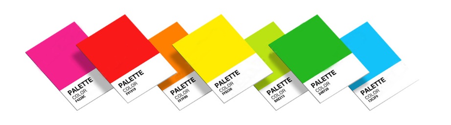
You Can’t Talk About Printing Without Talking About Colour
Colour can get confusing in the print world, mostly because screens and printing presses don’t “speak” colour the same way – a monitor builds colour out of light, while a press lays down ink. To make sense of it, it helps to know the three colour systems that come up again and again in printing: PMS, CMYK and RGB.
PMS (Pantone Matching System)
PMS stands for the Pantone Matching System, a standard Pantone created so that ink colours can be specified precisely for commercial printing. You’ll often hear these called “PMS colours” or “spot colours” – a single, custom-mixed ink chosen for something like a logo, rather than being built out of a blend of other colours.
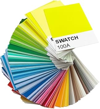
Customers pick their PMS colour from a physical swatch book, much like choosing paint at a hardware store – each swatch book contains a chip for every solid PMS shade. Some swatch books show both coated and uncoated versions of each colour; we work exclusively with coated stock.
There are well over a thousand solid PMS colours available for printing, and the terminology comes up so often in our work that it becomes second nature. One key thing to remember: digital printing equipment can’t print a PMS ink directly – a PMS colour always has to be converted to a CMYK equivalent first.
CMYK (Cyan, Magenta, Yellow, Black)
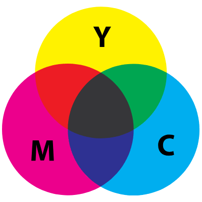
CMYK refers to the four ink colours – cyan, magenta, yellow and black – used for full-colour (sometimes called “four-colour”) printing. A full-colour image is really made up of thousands of tiny dots in these four colours, layered to create the illusion of a much wider range of shades.
When a job calls for full colour, we reproduce your chosen colours by blending these four inks. If your artwork specifies an exact PMS colour, that job may need a different decoration method to hit it precisely – some swatch books (called a Pantone Colour Bridge) show a PMS chip side by side with its closest CMYK match. Look closely at CMYK printing with a magnifying loupe and you’ll see a pattern of small dots; a true PMS spot colour, by contrast, is a single flat layer of ink with no dot pattern at all.
RGB (Red, Green, Blue)
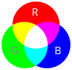
RGB is the colour system your screen uses – every colour you see on a monitor is built from combinations of red, green and blue light. Think of RGB as the “on-screen” colour space, versus PMS and CMYK, which are both “on-paper” colour spaces.
RGB and CMYK overlap somewhat, but they’re not the same range of colours – RGB can display more colours than CMYK ink can reproduce. Because of this, any artwork has to be converted from RGB to CMYK before it goes to print (we handle this conversion), and a small, unavoidable shift in colour can happen along the way.
Moving between PMS, CMYK and RGB is a routine part of prepress, but it’s worth knowing up front that what you see on screen and what comes off the press won’t always match exactly. We work with colour every day and are happy to talk you through what to expect, so your finished print job comes out looking the way you planned. Hopefully this gives you a clearer picture of how PMS, CMYK and RGB differ – useful background whether you’re briefing your printer or your graphic designer.
Want a handy reference? A free Pantone colour chart PDF will be linked here for download.
A note on accuracy: every monitor displays colour a little differently, so a PMS colour may look slightly different on screen than it does printed, and can also vary depending on the colour of the product it’s printed on.